ETF2L Gets a New Layer of Paint
 July 18, 2018
As ETF2L has now seen its 10th Anniversary we have worked on giving the site a fresh look for the future. Constructive feedback is always appreciated and if you find any issues feel free to let us know and we’ll look at it as soon as possible. The changes are only visual changes and should not affect any of the existing features.
Some of the changes might not be visible instantly due to your browser caching styling items. To easily clear you cache for ETF2L only you can use a keyboard shortcut. Either ctrl + F5 or for MAC cmd + shift + R.
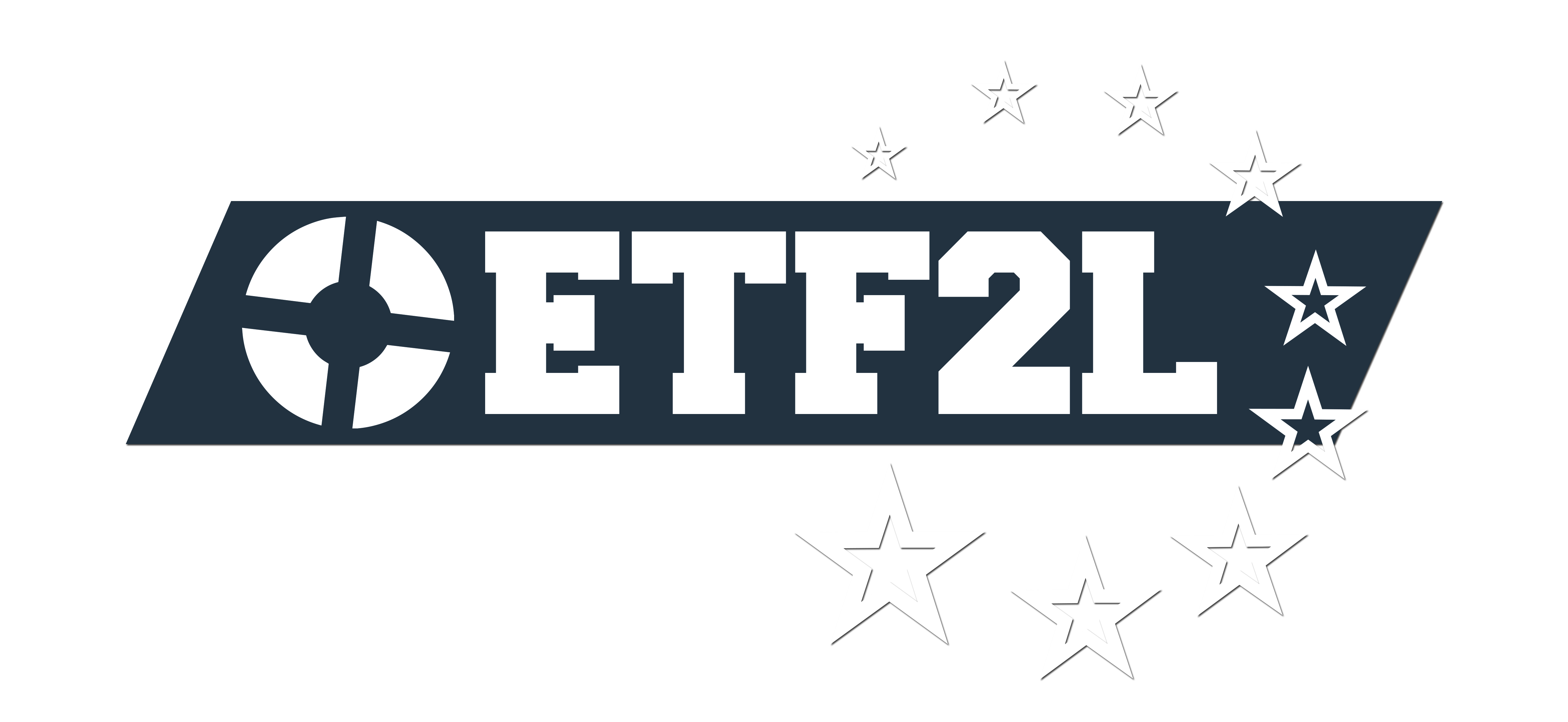
One of the changes is to our main logo. You can find our brand guidelines down below.
ETF2L Brand Guidelines
ETF2L Logo
Please don’t edit, recolour, or change our logo in any way.
Alternative Logos
These should be used only if the other logo has already been used on the same page, and is clearly visible. The phrase “European Team Fortress 2 League” should also be included in your design somewhere when using these, especially if you choose not to show the main logo.

for light backgrounds for dark backgrounds
If you want to use any of our logos, contact our media staff for approval of your design. This is just so we can ensure our logos are being used properly. You can contact our media staff through the ETF2L Discord.
ETF2L on social media:
![]() Follow us on twitter!
Follow us on twitter!
![]() Like us on Facebook!
Like us on Facebook!
![]() Join our Steamgroup and invite your friends!
Join our Steamgroup and invite your friends!
![]() Use our Discord
Use our Discord
 Posted by ETF2L Staff in League, Site


 content rss
dark theme or quitting tf2
bring back grey and orange tin or gay
Waaay too bright in my opinion.
The logo in the banner should have a link to return to the homepage
Definitely needs either a dark theme or a re-evaluation of how the current text is sitting on light backgrounds with light type colours. Currently, some information is lost, hard to read or doesn’t attract the user’s eye which makes the new revamp less user-friendly than its predecessor. An example of this is the player controls in the top right of the website banner, which on higher brightnesses could pose an issue for visibility
Some other features should be worked on or removed, as they are outdated already and look even more so with the new changes. Examples of this include black text boxes on team roster pages, the overuse of horizontal rules and the current visuals of the forums not being in line with the rest of the website.
Also, agreed with WildPiggie, let the banner be clickable and allow you to return to the home. New-ish logo is cool too.
Dark version of the theme would be appreciated, as well as the return of a link to the home page in the banner.
Time to tinker with some CSS in the mean time; Result of 20 minutes to get a darker version: https://i.imgur.com/98yUPfv.png
looks great
font visibility issue with the top right panel located on the etf2l banner
https://i.imgur.com/PcV9e3L.png
a fix would be either a change of font size, colour or addition of a dark/black shadow onto the
orange font(current one is bright i assume)
The anchor for the old logo is still in the same place as the old version, probably already figured that out but incase you hadn’t
tables/recruitment look completely out of place, it requires more work than a simple change of colours, but in the event of a design rework as well as colour rework i reckon its not going to be well received
please make side bars blue
previous user forum posts on any user’s profile remain not reworked and as a result “look off”
https://i.imgur.com/enVRd3s.png
another element missed out on
https://i.imgur.com/dexMvak.png
background of the sorting tab on recruitment remains untouched and “looks off” as well, i would opt for the darker of the two colours on the tables as the colour of choice
https://i.imgur.com/AEfLgh2.png
recruitment posts themselves background colour is not reworked
https://i.imgur.com/Bd2nzx4.png
way too little contrast between all the orange text and the white background
It’s rather bright. some light blue or maybe a black/orange colour scheme would work better.
a VERY rough idea of what I personally think would be an improvement (though remember this extremely rough) can be seen here:
https://imgur.com/a/uEuvW3G
TL;DR though: use shades of light blue to make the site feel less bright, or use a darker color scheme.
I think the space for text is generally fine, just fill up the blank sides with nothing on them with something dark.
Black/white is fine in terms of contrast but it’s incredibly bright, maybe a slightly darker shade would help to not destroy people’s eyes the same way everyone with Discord Light theme went blind in no time
Also are there any actual branding guidelines regarding colors? Asking cause I’ve been messing around with Xamarin Forms since honestly the mobile version of the website looks very unreadable to me
https://imgur.com/a/bwrDAFl
i really like t he change the white seems neat but the orange font colour really bothers me on that white maybe change it to some sort of darker colour or change the font completely maybe some broader bodied font like idk there are a lot
sorry but the colours are pretty awful
Never use full white, use off white
And you should probably guidelines on what background to place your logo, for instance it looks shit on the full white background you have and will look pretty bad on anything too bright or that clashes with the blue
forum/recruitment section/logo link placement should all be fixed
Main area colouring is set darker so nobody dies while having to submit match results tonight.
Keep in mind that we’re only testing things out and consistently looking for constructive feedback on it.
The comments here will be kept clear of just random messages that already have been posted or dont add anything to the conversation.
what still bothers me is the <> thing on top it still looks out of place with that font the font in which the names and team names are written could be quite nice i think. idk if thats even possible with wordpress but im just saying
eeh the my profile stuff i meant
Make a darker theme. That’s all I want.
i like the look but my eyes are in pain
make option to choose between dark/white theme, my EYES
apperantly it’s black now
so much better now
I’ll look at making it switchable tomorrow + some other minor stuff that got mentioned.
Also a bit more cleaning as this was done a bit in a rush.
really liking the black
the orange has nice contrast as well but i feel like it’s quite dominant on the black while on the white bg it was just to indicate something was clickable for navigation
that’s just a minor thing though other than that it’s a major improvement
the light coloured mountain banner also feels a bit out of place with the new dark design imo
Transfers colour rework remains from the bright version
Black good
EVERYTHING LOOKS DIFFERENT AAAAAAAAAAAH
That’s my constructive feedback.
One little thing i’ve noticed is profile avatars do not refresh after midnight
Should be working again.
Still not working somehow but it’s just a little mess anyway. Idk if it is because of the new layout or not.
@Aoshi Nevermind, it is fine now.