Forum
[HUD] broeselhud // version 2.9
Created 25th July 2010 @ 20:56
Add A Reply Pages: « Previous 1 ... 6 7 8 ... 73 Next »

Quoted from broesel
more feedback please!
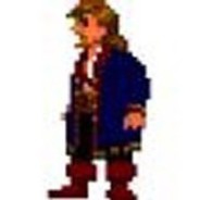
The floating model in the class selection has always bugged me a bit. The whole point of m0re’s hud was to remove any unneccesary visual clutter and have a no nonsense hud. So I kinda expected the same from a continuation of that hud :p

Quoted from RaCio
[…]The floating model in the class selection has always bugged me a bit. The whole point of m0re’s hud was to remove any unneccesary visual clutter and have a no nonsense hud. So I kinda expected the same from a continuation of that hud :p
lol no!
that class menu is the only thing in the hud that’s fancy and visual clutter etc and IT’S SO AWESOME <3
but if you want I can tell you how to remove the model.. I'll spam you on irc or w/e
Quoted from Mendietaaaa
really nice hud the only thing i would change is the ubercharge % in the spectator mode, it is difficult to read
thanks, good point

Quoted from RaCio
[…]The floating model in the class selection has always bugged me a bit. The whole point of m0re’s hud was to remove any unneccesary visual clutter and have a no nonsense hud. So I kinda expected the same from a continuation of that hud :p
+1
I mean yeah it looks good, but I’ve worked really hard and managed to memorise what each class looks like now so I dont need the picture anymore :)
changes so far
will have a look at the tournament spec %-charge label and the classmenus again, then it should be ready for release!
edit:
tired and pissed off atm – gonna release v1.2 tomorrow
VERSION 1.2 IS OUT, GO GET IT!
download: http://code.google.com/p/broeselhud/downloads/detail?name=broeselHUD%20v1.20.zip
this version changes (as previously mentioned) many details, so I definitely need A LOT of feedback on those changes ;)
changelog:
OBJECTIVES:
– made the CP HUD smaller (it’s now ~ as big as the minmode CP HUD from the default HUD)
– made the ctf HUD smaller and colored the scores
– made the PLR carts smaller – now for real ;D (messed it up in the last update)
– added proper support for PL tracks with hills (taller track in the HUD)
– made the round timer smaller – its size is now ~ between the too big old one and m0re’s too small one
HP/DAMAGE/AMMO DISPLAYS:
– m0re’s minmode HP display is now default and the colored one is the option
– damage numbers now are font size 23 (was 26)
– DISABLED (not deleted!) the low-ammo flash
—-(if you really want it back uncomment the lowAmmoPulse section in scripts/HudAnimations_tf.txt)
MENUS:
– removed the floating model from the class menu
– class menu is now more compact
– redesigned the quickswitch menu to fit the general, minimalistic style
– changed the semitransparent backgrounds of the build/destroy menu to make the text better legible
– redesigned the (simple) disguise menu
– fixed the simple disguise menu
SCOREBOARD:
– made the pub scoreboard smaller (vertically)
– rearranged the 6v6 scoreboard to match m0re’s layout
– changed the font of the scoreboard player list to surface
LAYOUT CHANGES:
– increased the gap between the 2 meters when using either Huntsman + Jarate as Sniper or Bonk + Sandman as Scout
SMALLER, OTHER CHANGES / BUGFIXES:
– fixed the KOTH timer
– made the Medic charge in the Tournament Spec HUD better legible
FONT CHANGES:
– changed the koth/arena countdown font to Surface
– changed the default font to surface
—– voicemenus, ammomod arena selection, mapvote menus etc. all appear with surface medium now

Quoted from broesel
its size is now ~ between the too big old one and m0re’s too small one
this size is somewhere between bad size & good size.
Quoted from dannye
[…]
this size is somewhere between bad size & good size.
with what HUD (m0re’s and mine meant here) being the bad size in your opinion?

Do you have updated screenshots as well?
Quoted from Septique
Do you have updated screenshots as well?
nope, will do that tomorrow

nice, I like how the class menu is smaller.


the only problem i always had with m0rehud is that in stopwatch maps like gravelpit, i can’t see the time score to beat on the top of the screen…
is it fixed in this one? if yes i’ll try this too :)

Quoted from Daggial
the only problem i always had with m0rehud is that in stopwatch maps like gravelpit, i can’t see the time score to beat on the top of the screen…
is it fixed in this one? if yes i’ll try this too :)
bind f12 hud_reloadscheme
Quoted from Daggial
the only problem i always had with m0rehud is that in stopwatch maps like gravelpit, i can’t see the time score to beat on the top of the screen…
is it fixed in this one? if yes i’ll try this too :)
I already have an idea how to fix this – but until I release 1.3, just use hud_reloadscheme ;)
Add A Reply Pages: « Previous 1 ... 6 7 8 ... 73 Next »


 content rss