Forum
[HUD] M0rehud 2.0
Created 20th February 2011 @ 14:41
Add A Reply Pages: « Previous 1 ... 3 4 5 ... 26 Next »

What about use the same style of winpanel for the scoreboard?
Names and scores at the top of the screen (double line)
Bottom line should be dedicated to persoanl score info
-edit-
I just forgot names and scores are grouped into lists. Not possible then
Quoted from revanxp
What about use the same style of winpanel for the scoreboard?
Names and scores at the top of the screen (double line)
Bottom line should be dedicated to persoanl score info-edit-
I just forgot names and scores are grouped into lists. Not possible then
yeah it would be awesome but cant do shit to that playerlist ;p. Keep the ideas coming :)

I think the way you did the scoreboard in SquareHUD would look nice here as well.

You have a beautiful mind M0re!
Still finding innovations in the boring world of HUDs :D
Don’t know if you’re open to suggestions, but for the ready panel, have you thought about doing just red/blue colored text at the top of the screen on no background instead of the text on the colored background?
Quoted from punct
I think the way you did the scoreboard in SquareHUD would look nice here as well.
I cant take any credit of the linkhud as all of it is mostly from links beautiful mind (lol pun intended seeing numbers and shit). I helped him in some parts and did some code but the design is link except few small little things.

maybe something like this for the 6v6 scoreboard?
1: http://slate-tf2.de/files/more6v6_1.png
2: http://slate-tf2.de/files/more6v6_2.png
Quoted from slate
maybe something like this for the 6v6 scoreboard?
1: http://slate-tf2.de/files/more6v6_1.png
2: http://slate-tf2.de/files/more6v6_2.png
+1 Looks really good
Quoted from boomer
Don’t know if you’re open to suggestions, but for the ready panel, have you thought about doing just red/blue colored text at the top of the screen on no background instead of the text on the colored background?
That sounds really good but not in this hud. I would have to do some major changes to design if I took that approach for tournament panel. I want to have this same basic look go over the hud.
Quoted from slate
maybe something like this for the 6v6 scoreboard?
1: http://slate-tf2.de/files/more6v6_1.png
2: http://slate-tf2.de/files/more6v6_2.png
derp
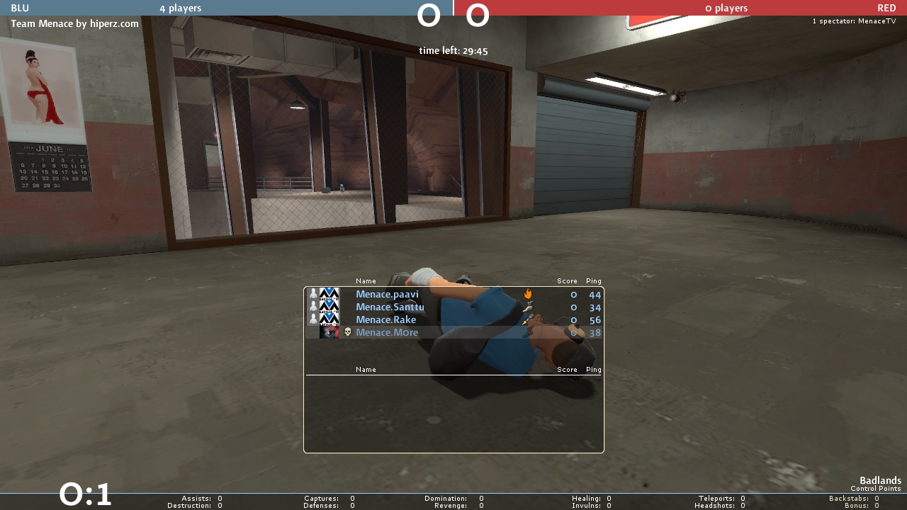
Quoted from M0re
[…]
how about this? http://fakkelbrigade.eu/more/M0rehud/cp_badlands0006.jpg
looking good.
glad you took the approach to have the teams on top of each other, way easier to read than next to each other.
I also made the scoreboard work with cl_hud_minmode toggle so no need to change files.
Are you keeping the same fonts, health styles etc. etc. et.c?
Quoted from WARHURYEAH
Are you keeping the same fonts, health styles etc. etc. et.c?
I’m keeping the same font, I’m not keeping health crosses so I’m making old minmode1 look out of this. Tho broesel said already that he is also intrested of these updates so some of it might end up to broeselhud as well. And he is keeping the old minmode0/1 with healthcrosses and shits if you’re into that look.

scoreboard and winpanel looks awesome.
When u gonna release ur new m0res hud or update it in Broesel hud ?
Add A Reply Pages: « Previous 1 ... 3 4 5 ... 26 Next »


 content rss