Forum
[HUD] M0rehud 2.0
Created 20th February 2011 @ 14:41
Add A Reply Pages: « Previous 1 ... 4 5 6 ... 26 Next »

Quoted from pykow
scoreboard and winpanel looks awesome.
When u gonna release ur new m0res hud or update it in Broesel hud ?
I dont have ETA at the moment. ~Couple weeks to release my new hud, broesel will follow after that.

no idea if you care or if it could be of any help.
I’ve made a version of broesels-minmode hud with every “_minmode” line removed and a combined scoreboard, so I could switch between pub and 6v6.
dunno if it maybe could save you some time coding.
Quoted from slate
no idea if you care or if it could be of any help.
I’ve made a version of broesels-minmode hud with every “_minmode” line removed and a combined scoreboard, so I could switch between pub and 6v6.
dunno if it maybe could save you some time coding.
Thanks i’ll take that :)

Quoted from M0re
[…]
how about this? http://fakkelbrigade.eu/more/M0rehud/cp_badlands0006.jpg
That looks nice, but I think would be better to move the time remaining on top of the scoreboard, so that it can be easily read.
derp
looks slick
really looking forward to this, looks great so far
Quoted from M0re
tournament specgui: http://fakkelbrigade.eu/more/M0rehud/cp_badlands0007.jpg
Also they start from the bottom so pub/highlander doesnt need seperate files as they just pile up.
hmm, isn’t it missing the medics uber percentage?
Dunno what do you think of this targetid: http://fakkelbrigade.eu/more/M0rehud/cp_badlands0008.jpg
dont mind the position, just tell me what do you think of that design?
low health:red
normal health:white
boosted health:cyan
these colors work in targetid and specgui

make the boosted one green… i have a feeling cyan wont be seen on that already blue bg
also ubercharge numbers needs to be much more visible imo… bold and size
but the blue bg itself is really good
Quoted from AnimaL
make the boosted one green… i have a feeling cyan wont be seen on that already blue bg
also ubercharge numbers needs to be much more visible imo… bold and size
but the blue bg itself is really good
It’s not the ubercharge what you’re seeing when playing medic, its description field under the name id when you spec :). Also I dont have any troubles with the cyan, it’s very clear and crisp. I only have troubles with the red low health on the red bg in specgui :)
ic
get a font that has outline then or smth
also remember spec huds will get heavy compression on TV streams and might have color issues, not sure if its the case in your
i like the old more hud =] i just started using the one of m0re.nocrits.com and i likes it
Quoted from Bonkers
i like the old more hud =] i just started using the one of m0re.nocrits.com and i likes it
It’s not working anymore, try this instead http://etf2l.org/forum/general/topic-11054/ (it’s updated copy)
Add A Reply Pages: « Previous 1 ... 4 5 6 ... 26 Next »


 content rss
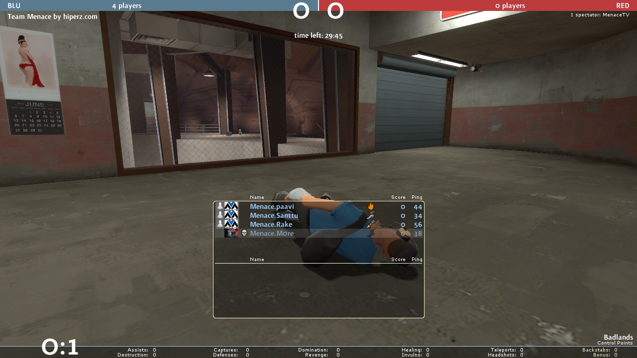