Forum
Lets talk about the banner contest
Created 19th March 2012 @ 00:03
Add A Reply Pages: « Previous 1 ... 3 4 5 6 Next »
Quoted from Dr-GimpfeN
http://dl.dropbox.com/u/5561243/etf2l.png i think it fits well without changing much on the theme
At first I thought “this is too elaborated, it seems it’s made by a random COD player, I can’t imagine it in etf2l’s site” but then..I like it! Actually there were many banner I liked, but I could have voted for this if I had see this on time.
I went for Supadupa #1, imo it’s the one which reflects the most the minimalistic actual logo style.
For second I voted for Phife because i probably fell in love with it. Very minimalistic but cool and also the colors are good.
I pretty like also Supadupa #2 and fainT/Evokje.
But I still don’t understand why, reading this thread, people like Kallio’s banner. First of all, the soldier it’s kind of disproportionate, I mean, it seems much higher than it is but this might be my point of view; and secondly I think that kind of style it’s a bit old and it needs a modern logo.

Quoted from Leif
[…]But I still don’t understand why, reading this thread, people like Kallio’s banner
because it doesn’t use every effect photoshop has.
the others are obviously made by turning on/off random layer effects without any deeper knowledge how this affects the overall image.
Quoted from Leif
[…]I think that kind of style it’s a bit old and it needs a modern logo.
only thing missing are animated gif skulls, blink-tags and some sort of LCD font ticker.
Last edited by dave,
I suspect ETF2L will get an angry letter in the post from Pepsi if they go with Paul Power’s banner
Last edited by Sylosin,

Quoted from broesel
What’s the deal? I created a tasteful, simple variant of the “blurred-out-map-scenery-background approach”, and just because it features a map background means it’s bad? I just think it’s kinda stupid to have a shitload of awful stuff in the vote that does NOT feature a map background simply for the sake of not having too many entries that DO feature a map background ;)
Get your logic straight, man :D
My logic is fine, you just misunderstand it ;)
Yours are fine, but there’s nothing to make them stand out. It’s just a map background with the site name and the sponsor logos. And then various filters over the top for the variations.
Yours are simple, yes, but in a way that suggests lack of effort and originality more than any design choice. I imagine the most time-consuming element of making them was getting the screenshots?
When you go for such a popular approach, you need something to make it stand out against other people who went for the same approach, and I prefer both Oxy’s #1 and Haze’s to yours. Oxy’s does simplicity better, and Haze’s clearly took a lot of effort, especially the detail in the sign.
Edit: I’m obviously slightly mad at the general lack of good taste and attention to details amongst people, so don’t even bother replying to my post :D
Damn, too late D:

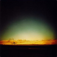
http://dl.dropbox.com/u/5561243/etf2l2.png this is how the Kallio banner looks when added to the page.
doesnt look that bad but for my self something is missing on it and it looks a bit boring :D
I like this one http://i.imgur.com/goiyx.png although the TT and Mplay logos are too close together
Last edited by atmo,
Quoted from Dr-GimpfeN
http://dl.dropbox.com/u/5561243/etf2l2.png this is how the Kallio banner looks when added to the page.
doesnt look that bad but for my self something is missing on it and it looks a bit boring :D
that looks pretty damn good imo

Quoted from Dr-GimpfeN
http://dl.dropbox.com/u/5561243/etf2l2.png this is how the Kallio banner looks when added to the page.
doesnt look that bad but for my self something is missing on it and it looks a bit boring :D
I think part of its popularity is due to how easy it is to think of it on the site – really, very little will change, as the style is very much like the current. It probably automatically then seems a bit boring because of that.
I don’t like the placement of the Tt logo though, bit too squashed in there next to the medic.
It pretty much would just slot right in without any effort required.
Last edited by Nymthae,


Quoted from phife
implying the etf2l website looks good or doesnt need some fixing
The site as a whole looks so much better than 99% of all gaming websites out there. Its simply and pretty easy to navigate.
Maybe you would rather the site be black and red with a banner and random tf2 characters and have the site look like an ugly clusterfuck which seems to be what most other gaming sites use..
Lol pandas http://freeimagesarchive.com/data/media/201/1_Pandas.gif
Last edited by dodgydogman,

Quoted from Nymthae
It pretty much would just slot right in without any effort required.
That’s what she said. (had to be done)
On topic, we actively encouraged entrants to try things outside of the current theme on the site. Personally I’m sick of orange and blue.
I’d prefer if the idea of a different theme was not considered a negative since we literally asked for it.
Quoted from dodgydogman
[…]
The site as a whole looks so much better than 99% of all gaming websites out there. Its simply and pretty easy to navigate.
Maybe you would rather the site be black and red with a banner and random tf2 characters and have the site look like an ugly clusterfuck which seems to be what most other gaming sites use..
Lol pandas http://freeimagesarchive.com/data/media/201/1_Pandas.gif
because the colors are the only thing here. its neither simple nor easy to navigate for people who are new. on the other hand its pretty simple to narrow it dont so its less clustered. people dont like change. seems like its the same thing here
Last edited by phife,
I’m personally not a fan of the simplicity of some banners. I’m missing the depth in the banners which makes the homepage a bit more “alive”, not just a flat page. (That’s why my logo looks like it does, and is quite unique in that way compared to the other banners. :))
I believe that every now and then everything needs a bit of a remake. Same colors/”theme” as the existing banner may not feel that cool anymore in a couple of months or years. That’s why I believe it needs a total remake to stay “modern”.
My 2 cents, and thanks to the people who votes for me!
Quoted from dave
[…]because it doesn’t use every effect photoshop has.
the others are obviously made by turning on/off random layer effects without any deeper knowledge how this affects the overall image.[…]
only thing missing are animated gif skulls, blink-tags and some sort of LCD font ticker.
Oh come on, having a psychedelic logo with random animated gif it’s not the same as having one looking cool and modern and attractive for new users.
Yes, some of them might have been made using random layers – I’m not keen on photoediting so I just know some very very basics stuff – and effects, in fact some are just horrible imo; but also this doesn’t mean that Kallio looks good instead, at least for me, obsly.
As I said, it looks disproportionate and also it’s neither attractive.
Edit: also, can someone be so king to make the homepage using Phife’s banners? Just wondering how it looks like.
Last edited by Leif,
Quoted from Leif
[…]Oh come on, having a psychedelic logo with random animated gif it’s not the same as having one looking cool and modern and attractive for new users.
No it’s not the same obviously. Never implied that.
But what some describe as a modern look is more of a distraction than a benefit. Many of those banners are to vibrant and are distracting from the content of the page. That’s being achieved by giving it “depth” as someone here called it (inner shadow for the banner, glow around font-blobs, embossed font…)
This is _comparable_ to animated gifs and stuff like that and can be considered bad practice. You don’t want people visiting your page to actually notice the header everytime they visit the page. It should be just there without attracting attention.
Add A Reply Pages: « Previous 1 ... 3 4 5 6 Next »


 content rss