Forum
Made some fake updates
Created 15th July 2010 @ 23:16
Add A Reply Pages: 1 2 Next »

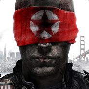
Day 1: http://dl.dropbox.com/u/3799499/dayone.jpg
Day 2: http://dl.dropbox.com/u/3799499/soli-update.jpg
There is gonna be 2 mor days.
Any opinions?

It doesn’t look like a team fortress 2 update at all:
The backgrounds don’t look tf2-ish. (“Painted”/low-res doesn’t suit tf2)
The title box and text isn’t tf2-ish.
Tf2 fonts weren’t used.
There are no 1st person screenshots in tf2 updates.
The back stories behind the weapons seem like they were written by a 5th grader.
Items aren’t that awesome.
Their stats are even worse.
There are numerous typos.
I liked the coupon and the “ol’ pete” model looks really nice.
Hopefully I wasn’t too hard on you. :)
btw, MANN CO. is a company that doesn’t really care about what their consumers think.

Spelling
Photoshop
1. => 1.2 => 2
the hell
aliasing is caused by saving it for web, to make the filesize smaller to be laoded faster, genius.
it says 1.1 then 1.2 THEN 2. its generally used to divide topics.
these updates are mainly for its weapons and what they do. yet, all i read here is useless ongoing about irrelevant stuff like anti aliasing and 1.1, 1.2 shit and spelling…
thanks for the constructive criticism
Quoted from phife
aliasing is caused by saving it for web, to make the filesize smaller to be laoded faster, genius.
nope, you screwed up
it says 1.1 then 1.2 THEN 2. its generally used to divide topics.
these updates are mainly for its weapons and what they do. yet, all i read here is useless ongoing about irrelevant stuff like anti aliasing and 1.1, 1.2 shit and spelling…
thanks for the constructive criticism
You could’ve just posted it as plain text then.
Why do you skip from 1.2 to 2? Doesn’t make any sense.
As for weapons:
The axe:
2x particle amount – Alright, more particles created by the flamethrower. But what does it mean? Bigger flames? Just more damage?
Airblast doubles particle speed – I’m going to assume you meant projectiles.
+5 dmg on hit – On all weapons?
-25% damage done – … but this seems to be specific for your “Overheater” weapon.
– 2x ammo use – Again, this seems to be general. Be consistent, god damn it.
Rocket launcher:
– “hamer units”. I’m going to assume you tried to spell “hammer” here. If you look at the official weapons, range is not measured in units. Also it’s not even called “Hammer units”.
– reloaded with m2 – What if I use M2 to jump? Dumb.
… not to mention balance issues.
Overall score 0/10.
Incredibly crappy. Do not try this again.
Last edited by d1ck j0nes,
Quoted from phife
aliasing is caused by saving it for web, to make the filesize smaller to be laoded faster, genius.
lol no
if you seriously think that then i don’t even know what to say to you
good effort, but you shouldn’t post if you can’t take constructive criticism.
Quoted from phife
it says 1.1 then 1.2 THEN 2. its generally used to divide topics.
1.1 and 1.2 have a different topic from 3 now?
Last edited by octochris,
Who the fuck are you jones?
You’re not playing in the league so kindly refrain from visiting the forums to flame people.
@ jones
what the fuck are you talking about. do have some issues using common sense? my bad, i forgot to explain the weapons for average joes like you, you can’t seem to use their brains to figure out what i meant. but thanks, i usually forget that, thats why i rewrote mos of the stuff to make it more clearly.
yes, bound the m2, because i have to bind to something. if you dont fucking like it, you always could re-bind it to another key. never came to your mind?
also i never said the layout isnt important. spelling, and understanding issues as well as aliasing isnt part of a layout..
thankfully, not everyone believes your crap and stops working on whatever theyre doing, but keep working on it to make it better. becasue if not, we still would be primates, who only ever bash shit with no good reason. just like you. get out my thread, and come back with arguments.
@ chris, i take constructive criticism already made changes to both the updates. anti aliasing on the fonts is caused by the font looking crappy themselves in ps. unfortunatly, blackoak and the tf2 fonts arent very polished and good fonts. check valves updates, its the same problem.
also, regarding balance issues. this is a WIP and a proposal what the new unlock could do. there is a lot stuff to discuss, so please, lets just discuss abilities and layout issues.
thank you
Quoted from Anathema
Who the fuck are you jones?
You’re not playing in the league so kindly refrain from visiting the forums to flame people.
Flame? Try constructive criticism. I can’t help that the OP – being a total ignoramus – disregarded it as “useless” and “irrelevant”. I edited my post to match his.
“Who the fuck are you”
What gives with this? I don’t know who you are either, but I don’t give a rat’s ass about it. FYI I happen to like the Movie section.
Last edited by d1ck j0nes,

Here is some pointers. From what i learned when making my promo for the polycount competition. ( http://img96.imageshack.us/img96/9614/promo2n.jpg ) This http://www.polycount.com/wp-content/uploads/2010/07/crocostyle.jpg is also good guideline to follow, including WAR update pages for demo and solly.
The big titles never use drop shadow. Its outer glow on normal blending more, increased spread and lowish opacity.
The big titles are never solid white, its very light grey to just a bit darker grey gradients.
Get backdrops separately from the renders. Don’t use actual in game shots. Take pictures of backgrounds you want without hud and high quality. Then take screenshots in model viewer of whatever you want to put in it, this gives you WAY more freedom on choosing camera angles, animations and so on. Make sure you force AA in your video drivers so you get rid of the jagged lines in model viewer. Then you have to draw on some shadows to give the effect that the render is actually in game.
Don’t be afraid to have parts of renders overlapping the titles and stick out the main frame, this is exactly what gives it more depth.
Don’t use any filters to try and force the cartoony look. Just sharpen the renders a bit and maybe play around with levels and colors correction a little bit if you want.
Use the colors from TF2 Color palette and try to stick to them
Gradients, gradients, gradients. They are everywhere, all the titles got black and white gradients set on overlay on low opacity to give them more depth.
No grunge textures… If you need a texture like the titles have use tf2 textures, using GCF Scape open up your “Team fortress 2 materials.gcf” And find textures for the titles like metal, concrete and so on then just drop their opacity so they dont stand out as much.
Like i mentioned before, the black outer glow is also almost everywhere, on titles, title boxes, renders, you name it.
For normal text use Verdana with no AA so it looks like its website typing. Size for it should be around 12 or 14 i believe. Don’t remember from the top of my head.
Main Title with class name on it also should include white class icon on low opacity.
There are 4 main fonts used. Blackoak for the biggest titles. TF2 font for smaller titles. Impact for other smaller titles. and Verdana for normal text.
And thats about it. You can learn more by just looking at the works i suggested and try to immitate them :)
Also how does that overheater work? You know wires don’t get hot themselves, you would need a power source connected to wires somewhere.
Last edited by Buck,
Quoted from Buck
Here is some pointers. From what i learned when making my promo for the polycount competition. ( http://img96.imageshack.us/img96/9614/promo2n.jpg ) This http://www.polycount.com/wp-content/uploads/2010/07/crocostyle.jpg is also good guideline to follow, including WAR update pages for demo and solly.
The big titles never use drop shadow. Its outer glow on normal blending more, increased spread and lowish opacity.
The big titles are never solid white, its very light grey to just a bit darker grey gradients.
Get backdrops separately from the renders. Don’t use actual in game shots. Take pictures of backgrounds you want without hud and high quality. Then take screenshots in model viewer of whatever you want to put in it, this gives you WAY more freedom on choosing camera angles, animations and so on. Make sure you force AA in your video drivers so you get rid of the jagged lines in model viewer. Then you have to draw on some shadows to give the effect that the render is actually in game.
Don’t be afraid to have parts of renders overlapping the titles and stick out the main frame, this is exactly what gives it more depth.
Don’t use any filters to try and force the cartoony look. Just sharpen the renders a bit and maybe play around with levels and colors correction a little bit if you want.
Use the colors from TF2 Color palette and try to stick to them
Gradients, gradients, gradients. They are everywhere, all the titles got black and white gradients set on overlay on low opacity to give them more depth.
No grunge textures… If you need a texture like the titles have use tf2 textures, using GCF Scape open up your “Team fortress 2 materials.gcf” And find textures for the titles like metal, concrete and so on then just drop their opacity so they dont stand out as much.
Like i mentioned before, the black outer glow is also almost everywhere, on titles, title boxes, renders, you name it.
For normal text use Verdana with no AA so it looks like its website typing. Size for it should be around 12 or 14 i believe. Don’t remember from the top of my head.
Main Title with class name on it also should include white class icon on low opacity.
There are 4 main fonts used. Blackoak for the biggest titles. TF2 font for smaller titles. Impact for other smaller titles. and Verdana for normal text.
And thats about it. You can learn more by just looking at the works i suggested and try to immitate them :)
Also how does that overheater work? You know wires don’t get hot themselves, you would need a power source connected to wires somewhere.
Buck is awesome
nice, greatw rite up. i shall try to implement those things.
as far as the overheater is concerned: wire can heat up through pressure and rubbing, so i just went with the idea that bodyflesh and the wire produce rub and pressure, and therefore its heating up. i know thats impossible, but it doesnt have to be exactly scientific in the world of tf2. but im open for suggestions. alreay thought about putting osmething else to it.
Just tape a battery to it with a few wires. Even though even that isnt enough to get this length of wire red hot it makes sense in TF2 world. Now getting wires red hot with just power of friction (Rubbing against people lol) Is crazy EVEN in the world of TF2 :D
Add A Reply Pages: 1 2 Next »


 content rss