Forum
Lets talk about the banner contest
Created 19th March 2012 @ 00:03
Add A Reply Pages: « Previous 1 ... 4 5 6 Next »
dave, You clearly misunderstood what I meant with depth. I’m not talking about some random effects on the fonts nor the background. I’m talking about the layout of the banner, at what position things are, what background that’s being used. Only some font effects doesn’t create any depth to a picture, only to the text.
Your opinion is that the banner shouldnt draw any attention to itself, but on the other hand, why have a banner at all then? Maybe just some text and the same BG color as the homepage. I believe a nice banner that draws attention to itself makes the homepage look professional, and makes the visitor interested at looking further into the homepage (if it’s a first time visitor that is). And I’m sure many of the banners that aren’t simple have a lot of thought behind them, not just some random layers and filter effects. But we all have different opinions of course!

Quoted from Leif
[…]
Edit: also, can someone be so king to make the homepage using Phife’s banners? Just wondering how it looks like.
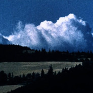
http://i.imgur.com/G9VBL.png Bit short, but you can see how it goes
I quite like phife’s style generally.
Lose the gradients please.
Quoted from Nymthae
[…]
http://i.imgur.com/G9VBL.png Bit short, but you can see how it goes
I quite like phife’s style generally.
+1

Quoted from almightybob
EDIT: also admins there is no capital letter in my name kthxbai.
Thanks! <3
paul and kedane >>>

Everyone viewing ETF2L.org with AdBlock enabled is killing TF2…

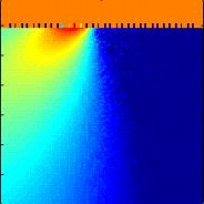
Quoted from Dr-GimpfeN
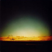
http://dl.dropbox.com/u/5561243/etf2l2.png this is how the Kallio banner looks when added to the page.
doesnt look that bad but for my self something is missing on it and it looks a bit boring :D
i see, vote kallio
Wow, this Kallio’s banner is literally half Russian.
as it’s unlikely that any single banner gets a majority, I say there should be a subsequent run-off poll for the top two banners, rendering a single decisive result and thus enforcing the democratic legitimacy of this community
power to the people
Quoted from Dr-GimpfeN
http://dl.dropbox.com/u/5561243/etf2l2.png this is how the Kallio banner looks when added to the page.
doesnt look that bad but for my self something is missing on it and it looks a bit boring :D
Looks sick, Kallio sick :3

Reposting my newspost comment:
I like Kallio’s banner a lot as well. But why are there 21 stars? Why not 12 (number of stars on the Flag of Europe) or 27 (number of members of the EU right now)?
Quoted from Selek
I like Kallio’s banner a lot as well. But why are there 21 stars? Why not 12 (number of stars on the Flag of Europe) or 27 (number of members of the EU right now)?
If you will add some stars behind “ETF2L”, there will be exactly 27. But for an aesthetic purpose they were removed.

Quoted from envy
[…]
If you will add some stars behind “ETF2L”, there will be exactly 27. But for an aesthetic purpose they were removed.
thats half arsed. they were clearly added to resmble the flag of europe, or one coudlve just put ponies or burgers there instead. easy way out tbh. being aesthetic isnt the only purpose of graphics.

Add A Reply Pages: « Previous 1 ... 4 5 6 Next »


 content rss