Forum
My Banner - feedback wanted
Created 27th February 2012 @ 18:16
Add A Reply Pages: 1 2 ... 8 Next »

SUP CRASP?
Hi everyone.
I’d love some feedback on mah banner –
just banner:
http://i1242.photobucket.com/albums/gg528/trathh/tt-3.jpg
put “in” the etf2l current site :
http://postimage.org/image/t2y66x1hd/full/
getting dat headset would be saving me 100$+ for headphones+mod mic. I know it wont be even close to the sound level but I would rather use 100$ for something else.
SOO
all comments are appriciated.
thanks


terribad
didn’t like it, sry.
i was going to say to anything that mine is much better but in that case mine is rly much better :P

The text which says ETF2L etc etc really look out of place, the colours arent really well chosen as they do not work really well together, and they do not really stand out a lot from the background image. That’s the stuff i noticed the most
Quoted from Genmix
The text which says ETF2L etc etc really look out of place, the colours arent really well chosen as they do not work really well together, and they do not really stand out a lot from the background image. That’s the stuff i noticed the most
and try to get aline where you position your information, yours looks random

Quoted from atomic-
terribad
didn’t like it, sry.

The background is far too blurry/styled. It makes you feel like you’re desperately in need of a pair of glasses.
The colours of your main ETF2L text don’t stand out at all from the main image, thus making it difficult to focus on what’s actually on the screen.
The random grey medic and sniper elements offer very little to the banner.
Position of the elements on the screen appears to be utterly random. Would suggest reading about alignment.
Best of luck with a re-design :)

Well I cant help im color blind. I didnt want to put the positions at “fixed to the same line” type of thing, but I ill try with.
Ill have to get lucky on the colors though.
Will switch the BG.
many versions coming to a theater near you, soon.
alright, round 2:
http://i.imgur.com/4zFDG.jpg
http://i.imgur.com/SSNhU.jpg
My opinion:
Everything is perfect.
Except:
BG maybe a little brighter?
MultiPlay and ETF2l a TINY smaller.
ETF2L color is bad.
Last edited by Trath,
the font of ‘ETF2L’ is pretty horrible, and the colour
Last edited by Permzilla,
perfect? better be joking
Add A Reply Pages: 1 2 ... 8 Next »


 content rss
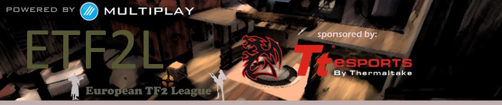